|
|||||
|
|||||
 |
 |
|
|
the original design was intended only for the clothing, which was a little behind
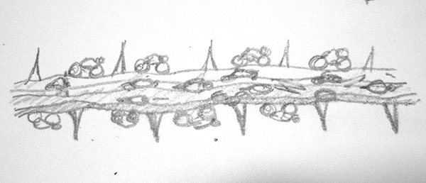
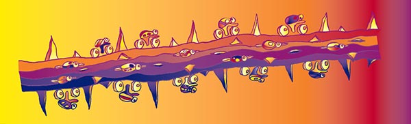
little cyclists on an ocotillo branch — it looked promising.
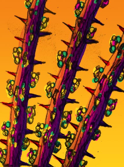
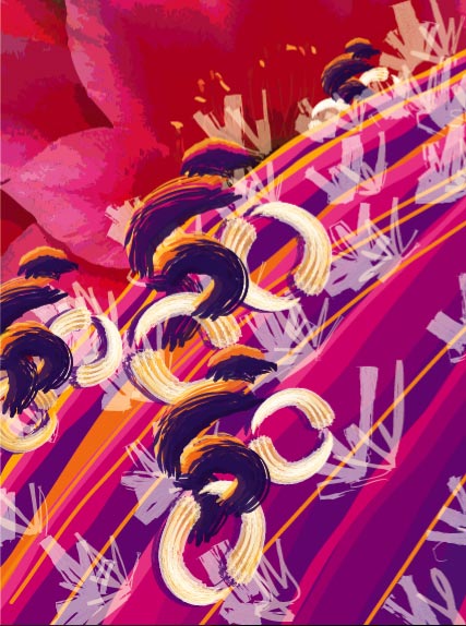
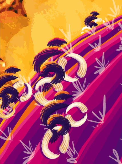
we tried different backgrounds and colors to see what might work with the bugs.
we also tried a few other quick comps to see if anything else might show promise.
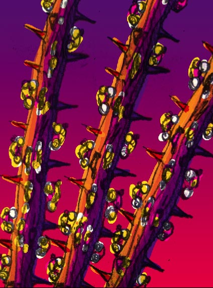
we mocked up the doodle with some color and this version was given the green light to continue.
after a little redrawing on the computer, we colorized the branch. if we had more time, we would have drawn several more branches [if you hadn’t noticed, the 3 branches and cyclists are identical].
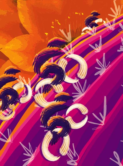
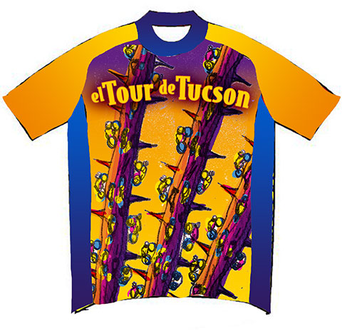
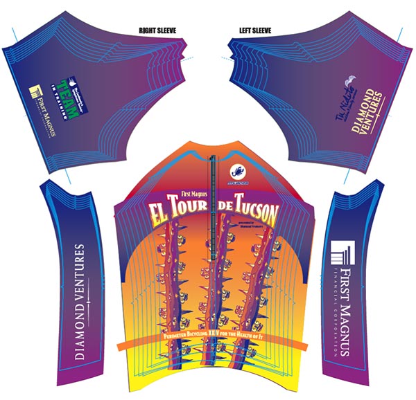
with just 5 spot colors to work with, we started with a purple trimmed jersey...
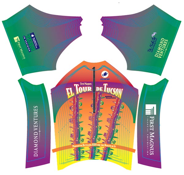
then moved to a green jersey [not quite the most beautiful colors]...
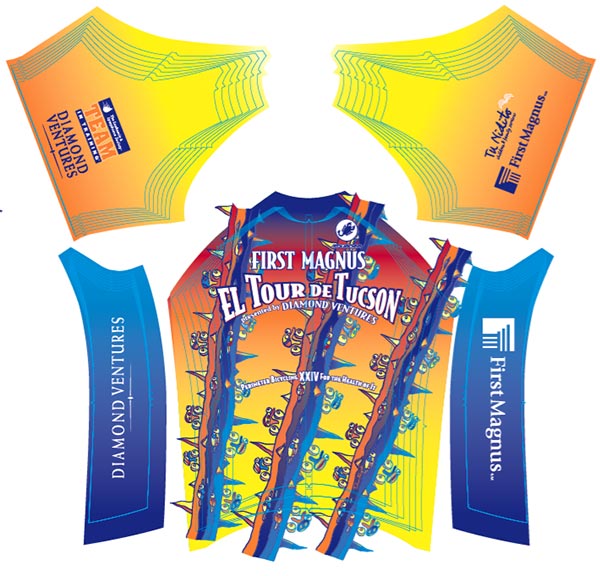
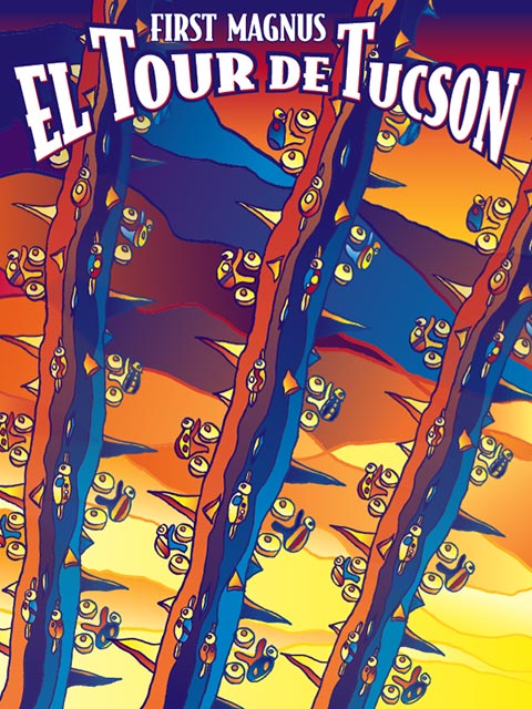
and then to the final jersey. the light blue lines are the cut lines for all the sizes to be made. after we completed the jersey and it was sent off, the decision was made to have the event poster match the jersey [it only makes sense, right?]
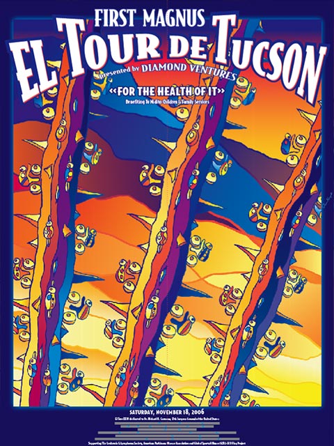
getting the «blank» version wasn’t that hard. adding the small text always is.
we tried out a lot of variations until the bottom one with the blue fade.
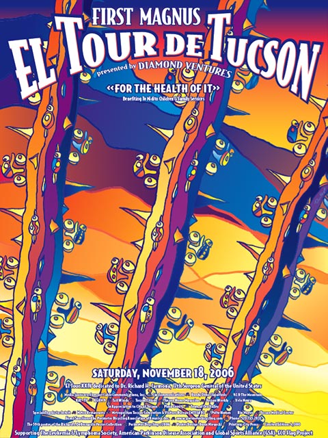
El Tour de Tucson's 2006 Event poster
|
||
|
to contact us, email us at nfo@mbtween.com or call 520.748.9094 |